Maybe it’s because of the pre-Christmas intensity of the ANC’s elective conference, or maybe it’s just because I don’t work a daily news beat at the moment, but it feels a bit like the matric results aren’t quite the news event this year that they normally are. (I suspect it’s the latter, I’m a bit out of the loop…)
Nevertheless, I wanted to scrape the results data for the third year running and update my matric map (you can see last year’s here). I’ve not done as much work as last year to update details on schools which have either changed their name, closed down or opened as exam centres for the first time this year – but I will be revisiting this data at some point in the next few months to rework the maps using R rather than Tableau.
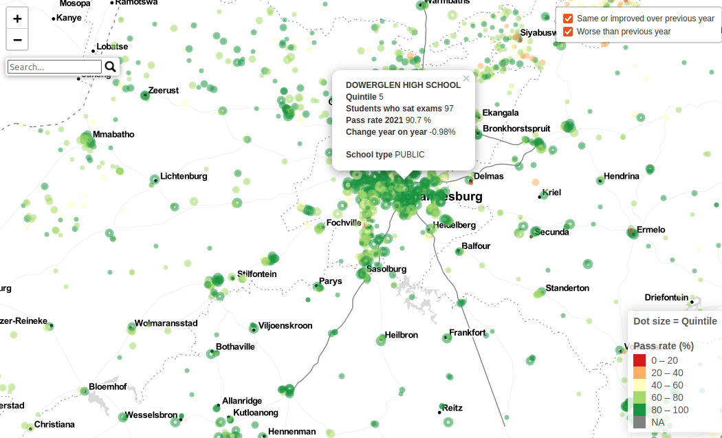
So what’s new from last year? Not a lot – top level analysis is broadly the same but my treatment is slightly different. There’s not as much information on the maps – too many filters slow down the public version of Tableau – but I have included a comparison with last year showing which schools did better or worse overall. I don’t think that there’s a lot to reaad into that at the individual school level – several successful Gauteng schools seem to record lower passrates year-on-year, which I think is likely to be more to do with them increasing in popularity rather than declining in standard, for example. I do think that comparison map gives you an interesting top level view of regional changes, though. There’s a lot of really strong improvements in KZN and the Eastern Cape, but it’s by no means across the board.
The size of the dot representing each school is based on the official “quintile” score relating to the wealth of a school. Richer schools (quintiles 4 & 5) are larger dots.


Leave a Reply